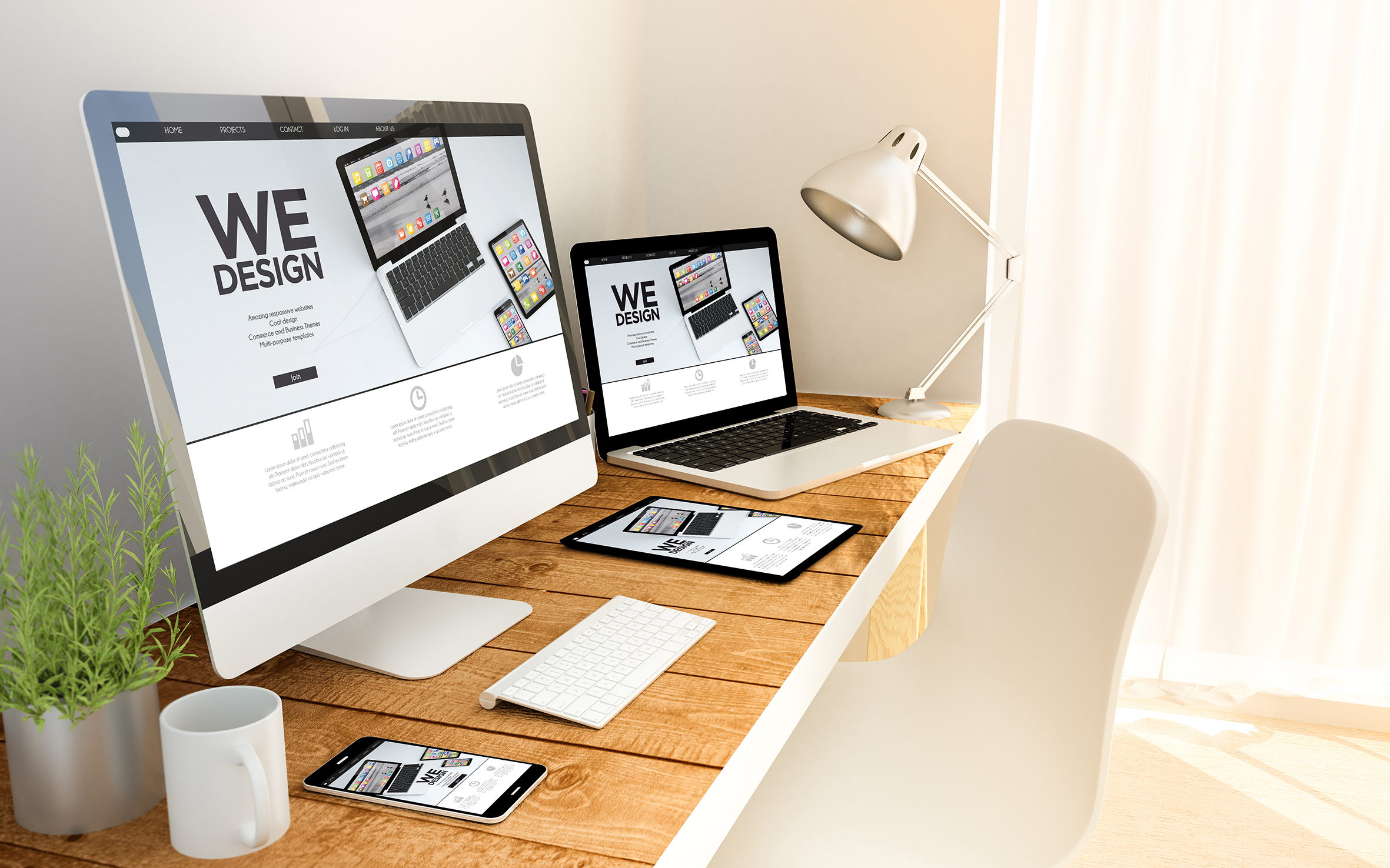
Why a Unique, Personalized Logo Matters
Your logo is more than just a symbol—it represents the face of your business and serves as the cornerstone of your brand identity. A well-designed, personalized logo captures the essence of your business and effectively communicates your values instantly.
Here’s why having a unique logo is essential:

First Impressions Count
Your logo is often the first thing potential clients notice about your business. A well-designed logo creates a memorable and professional impression that sets you apart from competitors
Builds Brand Recognition
A unique and consistent logo makes your business easily recognizable across platforms, helping clients remember and trust your brand.
Reflects Your Brand Identity
A personalized logo tells the story of your business, incorporating colors, fonts, and symbols that align with your vision and mission.
Establishes Credibility
A professionally crafted logo demonstrates that your business is serious, reliable, and here to stay.
Our values
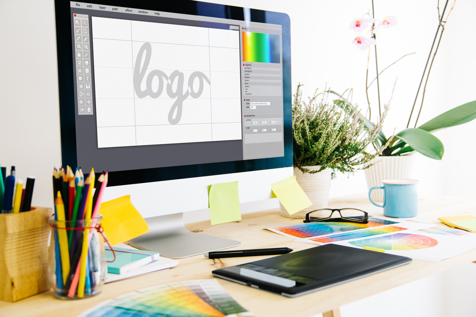
Our Logo Design Services
I specialize in creating custom, memorable logos tailored to your business’s unique identity. My services include:
- Consultation: Understanding your vision, industry, and target audience.
- Unique Designs: Developing original concepts that align with your brand values.
- Revisions: Refining the design until it perfectly represents your business.
- Deliverables: Providing high-quality files suitable for all your branding needs, from websites to print materials.
Invest in a logo that leaves a lasting impression and truly represents your business.
Let’s create something unforgettable together!
OUR PORTFOLIO
When building a new brand, a visually appealing logo with suitable colors is essential. The right colors not only enhance the logo’s aesthetics but also ensure it resonates with your business’s purpose and values.
Colors play a crucial role in creating a connection with your audience, conveying the essence of your brand at a glance. For clients who are still deciding on a name for their brand, I offer expert guidance to help them discover the perfect name and a catchy tagline that will set their brand apart and leave a lasting impression.
Explore a selection of our recent logo projects below to see how we bring brands to life.
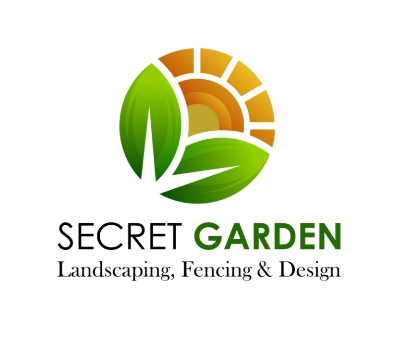
Secret Garden Projects Logo
The Secret Garden logo was designed to beautifully encapsulate the essence of landscaping and outdoor design. Every element of the logo was carefully crafted to reflect the project’s focus on natural beauty and harmonious design.
- Symbolism in the Logo:
- The sun symbolizes growth, warmth, and vitality, which are central to creating lush, vibrant gardens.
- The leaves, arranged like a sunflower, represent life, nature, and the flourishing environments that the Secret Garden project delivers.
- Thoughtful Design Process:
- I worked closely with the client to understand their vision and translate it into a visual identity.
- The color palette was chosen to reflect the vibrancy of nature, blending earthy tones with warm highlights that evoke feelings of comfort and energy.
- The combination of the sun and leaves not only showcases the project’s landscaping expertise but also emphasizes its commitment to creating inviting and sustainable outdoor spaces.
This logo stands out because it embodies the heart of the Secret Garden Project—transforming outdoor spaces into beautiful, functional havens that clients can enjoy for years to come.
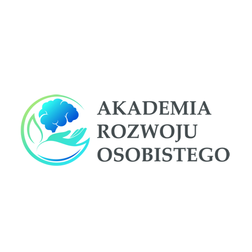
Akademia Rozwoju Osobistego Logo
The Akademia Rozwoju Osobistego logo was thoughtfully designed to embody the principles of personal growth, education, and mental development. Every element in the logo reflects the program’s focus on nurturing the mind and fostering a deeper connection to self-improvement and knowledge.
- Symbolism in the Logo:
- The blue and turquoise colors were chosen for their association with clarity, wisdom, and mental tranquility. Blue represents trust, calm, and knowledge, while turquoise adds a sense of balance and emotional healing. Together, they communicate a harmonious environment for personal growth.
- The hands are positioned above and extending out from the leaves, symbolizing guidance and care in nurturing growth. The hands represent support, protection, and empowerment, while the leaves below them symbolize renewal, vitality, and personal development.
- The brain, placed above the hands and leaves, symbolizes intellect and mental strength, signifying that the program helps nurture the mind toward greater clarity, focus, and personal achievement.
- Thoughtful Design Process:
- In collaboration with the program’s creator, I ensured that the logo visually communicated the mission of fostering personal growth and self-development.
- The carefully selected colors not only enhance the logo’s aesthetic appeal but also represent key aspects of the program’s goals—mental clarity, focus, and personal transformation.
- The hands extending from the leaves encapsulate the concept of guiding individuals in their intellectual and emotional growth, while the brain above represents the mental empowerment the program offers.
This logo perfectly reflects the essence of Akademia Rozwoju Osobistego—helping individuals develop their minds and embrace their fullest potential. It serves as a powerful visual reminder of the nurturing process that the program offers, guiding clients toward personal growth and mental empowerment.
Art for Wellbeing Logo
The Art for Wellbeing logo was designed to reflect the calming and transformative power of art in nurturing the mind. Every element was thoughtfully crafted to resonate with the core values of the program, which focuses on fostering mental wellness through creativity and self-expression.
- Symbolism in the Logo:
- The violet color was chosen for its association with tranquility, creativity, and emotional healing. It conveys a sense of peace and mindfulness, which is central to the program’s mission of nurturing the mind.
- The logo’s design gently evokes feelings of balance and calm, inviting clients to experience the therapeutic benefits of art in a serene and welcoming space.
- Thoughtful Design Process:
- I collaborated closely with the creator to ensure the logo aligned with the program’s ethos and vision.
- The vibrant violet shades not only represent spiritual growth but also symbolize the positive emotional shift that participants can expect through engagement with the art.
- The logo is a beautiful visual expression of what the program aims to share with its clients: the power of creativity to nourish and restore mental well-being.
This logo resonates deeply with the heart of the Art for Wellbeing program, capturing the essence of emotional healing, mental clarity, and the joy of artistic exploration. It serves as a peaceful and inviting symbol for those seeking to nurture their minds through the transformative power of art.
